
Aposematic.
Red squiggley lines keeps telling me that “aposematic” isn’t a real word, but it absolutely is; I Googled it just to make sure.
ap·o·se·mat·ic
/ˌapəsiˈmatik/
- (of coloration or markings) Serving to warn or repel predators.
- (of an animal) Having such coloration or markings.
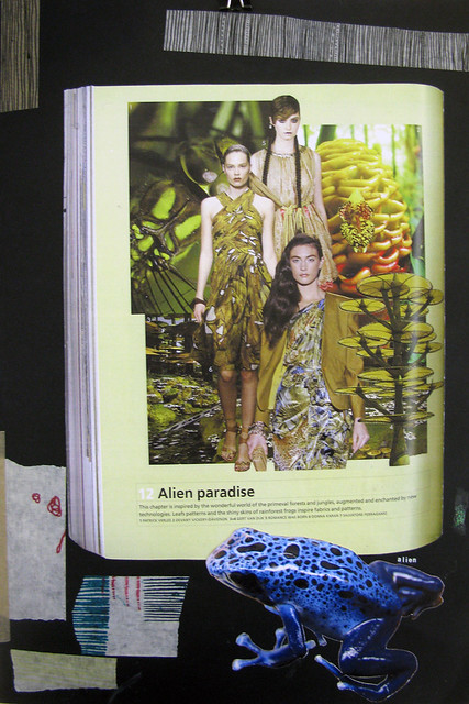
This is what I decided to name the collection of textile designs that I produced for the Society of Dyers and Colourists’s live project brief entitled “fashion for the future”. The brief was very open, but we had to work within two constraints: we had to work to a trend forecast from one of the big textile design journals, and we had to strongly consider sustainability or a sense of eco-friendliness in our designs.
The summer 2013 trend “alien paradise” in issue 96 of Textile View really jumped out at me (I’d originally chosen an Art Deco theme, but to be honest I really wasn’t finding it too interesting), saying “This chapter is inspired by the wonderful world of primeval forests and jungles, augmented and enchanted by new technologies. Leaf patterns and the shiny skins of rainforest frogs inspire fabrics and patterns.”
I originally visited Dundee’s botanic gardens to hang around in the hot house and photograph their tropical and carnivorous plants, but found that February isn’t really the ideal time of year for such things. I quickly moved on to looking at rainforest frogs, which I have absolutely fallen in love with. There are so many beautiful pattern and colour variations, and most of the frogs are absolutely tiny and adorable (and poisonous). This area of research obviously lends itself well to the sustainability factor of the brief, so I researched the Amazon rainforest and conservation charities.
I placed my designs into the context of interiors accessories (I do love a good cushion), more specifically kids’ bedroom accessories. I feel that the bright colours and graphic marks I have used would really sit well in a kid’s room, and the subject matter of the prints would help to get the young ‘uns interested in conservation, nature, animals, and travel. I also feel that the handmade element would really add value to my final pieces, and really creates an appreciation in the customer and a bond between them and the finished product, giving a very non-disposable feel to my work.
I hand-printed designs on habotai silk with acid dyes that I mixed myself. I ordered digitally printed silk with my own hand-drawn and Photoshop-coloured-in illustrations of frogs, and my grand plans were to hand print on top with my chosen colours and foil effects, but my prints took over a week to arrive and I received them about three hours before my printing workshop access was stopped, so that’s rather disappointing and I feel as though some of my prints are simply unfinished. However, I am pleased with what I produced in such a short time. I didn’t really know what context I was aiming for when I began printing and chose silk because I felt the delicate, airy, shiny feeling of the fabric was appropriate for my project, and silk really shows colour well; with my context now being kids’ interiors, I wish I had worked with a more durable cotton base fabric.
Here are a few pictures from my sketchbook; there are more (and larger versions) over on Flickr.


And here are my three final presentation boards (A2 in size):


You can’t really tell from the photo, but in between the frogs on the digitally printed fabric I’ve hand-printed lines of gold foil. Also the colours in the photos are a bit off (especially for the context board), but I think it gives a good idea of my project and final designs.
A patchwork pincushion.
In order to avoid doing any work on my uni summer project (and because I like sewing) I recently made a patchwork pincushion for a friend’s birthday. I got the idea and pattern from Very Berry Handmade, and my first attempt went terribly wrong when I tried make the cushion bigger than the pattern dictates but somehow grossly miscalculated things (probably to do with my terrible grasp of both numbers and logic, and for whatever reason sewing with a seam allowance two times too wide).
Anyway, I’m happy to say that attempt #2 went well (considering I’ve never really done patchwork before), and I was kind of sad to give it away. But I did. Selfless.

If you’re very interested, there are two more pictures on Flickr – one of the back, which is plain but embroidered with an “A”, and one of the ladder stitching I did to sew the cushion up at the end; it’s not perfect, but I’m happy with it! I hope she liked it.
I also “made” the pins as well. It’s the simplest thing in the world, and quite cute (I think) – I have a rather large collection of Swarovski crystal beads from back in my jewellery-makin’ days, and all I did was break out the superglue and glue the beads up against the pin head. It takes a while for the glue to dry, but if you’ve just made a pincushion it’s not as if you haven’t got anywhere to put them while it does!
Print week prints.
Here’s a wee sneaky peek at the prints I made during print week. They need a good press, and the raggedy edges need trimmed off, and I need to make header cards, and unfortunately a few of my prints went a bit splodgy, but if we forget all that I’m actually quite happy with them. To begin with, I was very tentative with my prints. I used a lot of similar colours/tones, and I was very delicate with my placement of the screen, or paper stencils, or whatever I was using. Eventually I got over that, and started to really embrace the idea of layering. That’s what this week was about – masking and layering – so I used a lot of paper stencils based on shapes from my sketchbook, and a lot of exciting colours, to hopefully produce some interesting overprints. On Thursday we had a little demonstration on using discharge paste, which lifts the dye back out of the fabric, and gives some really interesting effects because it reacts differently depending on the colour it covers. You can see some of the discharge paste’s effects in the blue sample, and the pinky-purpley one too. I enjoyed this week very much!

My print week prints, on silk.
Process into Practice: Mixed Media!
It’s mixed media week! This means that I’m mostly concentrating on fabric and embellishment. Our brief is based on repetition, and I’ve mostly been looking at stripes after choosing a couple of sketchbook pages (here and here) where I used a lot of simple lines in my drawings. The whole point of this week is to keep things as simple as possible, and there’s not much simpler than lines!
The most exciting new thing I’ve tried is embossing fabric using a heat press. It’s pretty cool. I raided the college shop for anything that might make a nice line, and came away with some paper straws, matchsticks, and corrugated card, and I also liberated some paper yarns from the yarn store.

Blanket wool set out on the heat press with some corrugated card and matchsticks on top.
I laid out my fabric (in this case some rather expensive blanket wool – £22 per metre!) and placed my corrugated card shapes and a couple of matchsticks on top to form some stripes.

The heat press clamped shut and counting down.
I set the heat press to sit at 180 degrees for 30 seconds. Unfortunately I don’t have a decent picture of the embossed fabric – it’s surprisingly difficult to photograph because the texture can be very subtle. Hopefully once the week is over I can photograph my finished samples and show them off.
Rather than waste my flattened-by-the-heat-press paper straws, I decided to use them in a sample, and I really liked the effect that I got from stitching them to felt.

Very stripy!
Today, I embarked on a bit of a dyeing adventure. I wanted to dye some of my blanket wool orange, because of the sketchbook page I mentioned earlier, so I mixed up a bath of acid dye using a mixture of “Golden Yellow” and “Bright Blood Red”. On a bit of a whim I decided to throw in a couple of scraps of cotton, and a small piece of viscose felt tied up with fishing line in a vague attempt at shibori. I knew the cottons and felt wouldn’t take the dye well because acid dye is the wrong type for those fibres, but I kind of just wanted to see what would happen. I’m glad I threw them in, because now I understand better how acid dye works on a selection of fibres (not well at all unless it’s wool or silk).

Busy bees in the dye lab!
I felt much more comfortable mixing dye today than I did on Monday. There was the initial mind blank when faced with having to calculate percentages and things, but I think I got all my numbers correct. Well, my dye started out looking very wishy-washy, so I measured out more of each dye colour and threw it in, and my blanket wool turned out almost exactly the shade I wanted, which sounds close enough to success for me!

Mah bukkit, bubbling away over the burner.

As you can see, the blanket wool (right) came out nicely; the others not so much!
And the week isn’t even over yet!


