
Aposematic.
Red squiggley lines keeps telling me that “aposematic” isn’t a real word, but it absolutely is; I Googled it just to make sure.
ap·o·se·mat·ic
/ˌapəsiˈmatik/
- (of coloration or markings) Serving to warn or repel predators.
- (of an animal) Having such coloration or markings.
This is what I decided to name the collection of textile designs that I produced for the Society of Dyers and Colourists’s live project brief entitled “fashion for the future”. The brief was very open, but we had to work within two constraints: we had to work to a trend forecast from one of the big textile design journals, and we had to strongly consider sustainability or a sense of eco-friendliness in our designs.
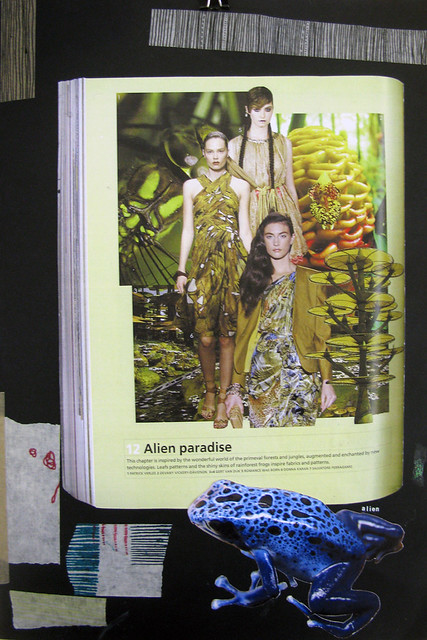
The summer 2013 trend “alien paradise” in issue 96 of Textile View really jumped out at me (I’d originally chosen an Art Deco theme, but to be honest I really wasn’t finding it too interesting), saying “This chapter is inspired by the wonderful world of primeval forests and jungles, augmented and enchanted by new technologies. Leaf patterns and the shiny skins of rainforest frogs inspire fabrics and patterns.”
I originally visited Dundee’s botanic gardens to hang around in the hot house and photograph their tropical and carnivorous plants, but found that February isn’t really the ideal time of year for such things. I quickly moved on to looking at rainforest frogs, which I have absolutely fallen in love with. There are so many beautiful pattern and colour variations, and most of the frogs are absolutely tiny and adorable (and poisonous). This area of research obviously lends itself well to the sustainability factor of the brief, so I researched the Amazon rainforest and conservation charities.
I placed my designs into the context of interiors accessories (I do love a good cushion), more specifically kids’ bedroom accessories. I feel that the bright colours and graphic marks I have used would really sit well in a kid’s room, and the subject matter of the prints would help to get the young ‘uns interested in conservation, nature, animals, and travel. I also feel that the handmade element would really add value to my final pieces, and really creates an appreciation in the customer and a bond between them and the finished product, giving a very non-disposable feel to my work.
I hand-printed designs on habotai silk with acid dyes that I mixed myself. I ordered digitally printed silk with my own hand-drawn and Photoshop-coloured-in illustrations of frogs, and my grand plans were to hand print on top with my chosen colours and foil effects, but my prints took over a week to arrive and I received them about three hours before my printing workshop access was stopped, so that’s rather disappointing and I feel as though some of my prints are simply unfinished. However, I am pleased with what I produced in such a short time. I didn’t really know what context I was aiming for when I began printing and chose silk because I felt the delicate, airy, shiny feeling of the fabric was appropriate for my project, and silk really shows colour well; with my context now being kids’ interiors, I wish I had worked with a more durable cotton base fabric.
Here are a few pictures from my sketchbook; there are more (and larger versions) over on Flickr.


And here are my three final presentation boards (A2 in size):


You can’t really tell from the photo, but in between the frogs on the digitally printed fabric I’ve hand-printed lines of gold foil. Also the colours in the photos are a bit off (especially for the context board), but I think it gives a good idea of my project and final designs.
Print week prints.
Here’s a wee sneaky peek at the prints I made during print week. They need a good press, and the raggedy edges need trimmed off, and I need to make header cards, and unfortunately a few of my prints went a bit splodgy, but if we forget all that I’m actually quite happy with them. To begin with, I was very tentative with my prints. I used a lot of similar colours/tones, and I was very delicate with my placement of the screen, or paper stencils, or whatever I was using. Eventually I got over that, and started to really embrace the idea of layering. That’s what this week was about – masking and layering – so I used a lot of paper stencils based on shapes from my sketchbook, and a lot of exciting colours, to hopefully produce some interesting overprints. On Thursday we had a little demonstration on using discharge paste, which lifts the dye back out of the fabric, and gives some really interesting effects because it reacts differently depending on the colour it covers. You can see some of the discharge paste’s effects in the blue sample, and the pinky-purpley one too. I enjoyed this week very much!

My print week prints, on silk.
Process into Practice: Print!
It’s print week! I’ve been really looking forward to print week, because I’ve always been fascinated by screen printing and for a long time I’ve wanted to learn how to do it. What we’re doing it quite far removed from what I used to think when I thought of screen printing – there are no pretty pictures printed onto cushion covers here! We’ve had to pick a texture from our sketchbooks to transfer to a screen; brush marks, splash marks, swishy lines – anything that’s come up in our sketchbooks from drawing, mark-making, collage, whatever! I made a screen covered in hand-drawn lines/stripes, based on the same sketchbook page I used as the basis for my mixed media work last week. Making screens is really exciting – you get to use the massive UV light exposure unit, and the pressure hose, and there’s a wee bit of apprehension as to whether it’ll actually turn out properly, or whether it’ll actually make nice prints. As it stands, though, I’m quite happy with my screen!

Busy little bees in the print workshop.
Our prints, along with teaching us about printing techniques, are an exercise in layering and masking. At first, I was trying to be very considered with my colours and the placements of my screen and paper stencils, but really I think I was just a bit intimidated to try anything “outrageous”. As my confidence has grown a bit with the printing process, I’ve begun to use a lot more, brighter colours, and do a bit more interesting (hopefully!) layering. I’ve decided that, well, what can really go wrong? Print some yellow, red, blue, see what happens. If it really looks awful, either put more on top, or tomorrow we’re learning about using discharge paste to remove the dye from the fabric. And if it’s really, really horrible and unfixable, well it’s only a little piece of silk – you can buy more!
This morning I mixed up a couple of dye pastes, so I’m looking forward to using those tomorrow, and seeing if my calculating and measuring skills are really as reliable as I assumed they were at the time.

My printing station - using masking tape.
Also, this week, I’ve spent over £5 on masking tape. Scandal! Must learn to use the stuff more economically.
Mixing dye paste.
After a print workshop with our technician Norrie this morning where we learned about making printing screens by masking and stencilling (which is exciting in and of itself!), one of the pieces of homework we were given (is it still homework if you can’t take it home to do?) was to mix up a dye paste on our own, without being supervised. We were shown last week how to mix up a dye bath, and the procedure for mixing a print paste is essentially the same, just with a couple of different ingredients. Vanessa and I paired up to do this this afternoon, after our D’Arcy Thompson museum tour fell through, so that we could just get the task out of the way, really – we didn’t really see the point in leaving it for days, when the idea was fresh in our minds and we were already in ‘self-directed study’ time. Also, I trusted Vanessa to keep me right, which she did! In the dye lab I was very overwhelmed to start with – I got a bit confused about what we were doing, I think because I was forgetting that the dyes we mixed last time were something completely different to what we were meant to be doing this time. After spending a few minutes looking over the very helpful (if mildly confusing when you don’t know where to look) work sheets on the wall, we asked Norrie for a little bit of help, and he very nicely reassured us that we were looking in the right place, and things would probably go perfectly well if we just followed the instructions. And they did! Or maybe I should wait until we try printing with the stuff before I congratulate myself…

L - R: 2g Rubine Red, 2g Royal Blue, 8g Golden Yellow.
First, we measured our dye. Norrie is very sneaky, and asked us to mix 400g instead of 100g (the default on the ingredients lists), which meant we had to do some sums. Nothing difficult, thankfully! Looking for a little danger, we chose a mix with three dyes instead of just two, although we stuck with a 3% strength (3% makes the full shade, so no matter how much more dye you add, the colour won’t get any stronger) to save from having to do more sums!
We added some urea (yes, it is what you think it is), ammonium sulphate, Glyezin BC, boiling water, and indalca, which all sound very scientific, but essentially what these things do is help the dye powder to dissolve, or help carry the pigment, or help thicken the mixture, or possibly a bit of all three (I’m not quite up on all the details yet!).

Mixing our three dyes together.

Indalca looks kind of gross, but is quite satisfying to play with.
In the end, we produced a nice wee tub of a kind of foresty-greeny sort of dye. Hopefully that’s the colour that’s supposed to appear from this mixture! I can’t wait to print with it and see how it all turns out.

Our finished product - a 400g tub of dye paste!


